


Van Briggle Pottery Marks: How to Identify and Date Van Briggle
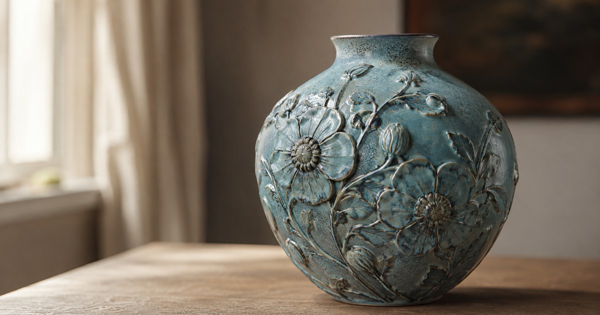
Van Briggle pottery marks are unusually easy to recognize and unusually hard to date, and most guides only solve the first half of that problem. They show you the conjoined double-A logo, tell you it stands for Artus and Anne Van Briggle, and stop. That is fine if all you want to know is whether a piece is Van Briggle. It is useless if you want to know whether the vase on your shelf left Colorado Springs in 1905 or 1975, and since the pottery used a recognizably similar logo for its entire long life, that is the question that actually matters.
Van Briggle pottery marks nearly always feature an incised or molded double-A monogram, two capital As sharing a center stroke, usually with “Van Briggle” beneath it. Dating comes from what accompanies the logo: an incised year, a shape number, “Colo Spgs” or “Colorado Springs,” the addition of “U.S.A.,” or a smooth in-mold mark instead of a hand-cut one.
Quick identification checklist
- Find the monogram first. Two capital As joined at the middle, set inside a rough square. If it is hand-incised with wobbling, uneven strokes, you are in the earlier end of the range. If it is crisp and part of the mold, you are later.
- Look for a four-digit year. Early pieces frequently carry an incised date. A year on the base is the single strongest dating evidence Van Briggle offers, and its absence is itself informative.
- Read the place line. Variants of the Colorado Springs location appear across the mark history in different abbreviations and spellings, and the wording shifts over time.
- Check for “U.S.A.” Country-of-origin wording is a later addition rather than an early feature, so its presence pushes a piece forward on the timeline.
- Note the shape number. Early pieces often carry a hand-incised model number alongside the logo, tying the vase to a documented catalog form.
- Judge the glaze, not just the mark. Matte glaze color and surface quality separate the early art period from the later commercial output more reliably than the logo does.
The short history that explains the marks
Artus Van Briggle was an Ohio-trained decorator who worked at Rookwood in Cincinnati and spent time studying in Europe, where he became preoccupied with reproducing the soft matte glazes of Chinese Ming-era ceramics. Tuberculosis pushed him west to the dry air of Colorado Springs at the end of the 1890s, and he established his own pottery there at the start of the 1900s. He died young, only a few years after opening the works, and his wife Anne Van Briggle carried the pottery forward.
That biography is not trivia, it is the reason the mark looks the way it does. The double-A monogram is the two of them, and it outlived both. The pottery continued operating in Colorado Springs for the better part of a century afterward, changing owners, locations, and production methods while keeping the founding logo. This is why the mark alone cannot date a piece: a company that used one logo for a hundred years has told you almost nothing when it tells you the logo is present.
How Van Briggle pottery marks changed over time
Think of the monogram as having three broad phases rather than dozens of discrete stamps.
The earliest phase is fully hand-worked. The As are cut into the wet clay with a tool, the strokes vary in depth and width, the two letters are often slightly different heights, and the surrounding square is irregular or absent. Around this monogram you commonly find an incised four-digit year and a shape number, also hand-cut. Everything on the base looks like it was written by a person, because it was.
The middle phase keeps the hand-incised character but drops the year. Once dating stopped being routine practice, the base typically carries the monogram, the name, and a place reference, sometimes with a shape number, but no calendar anchor. This is the largest and most frustrating group, and it is where matte glaze color does most of the dating work.
The later commercial phase moves the mark into the mold. The monogram becomes uniform, evenly raised or evenly recessed, identical from piece to piece, and it sits alongside standardized wording that can include the state name spelled out and a country-of-origin line. Uniformity is the tell. A mark with no human variation in it was not cut by hand.
Using matte glaze color as a dating clue
Van Briggle built its reputation on matte glazes, and the palette turned over across the decades. Learning the colors is the practical substitute for a date on the base.
The early art-period glazes tend to be soft, slightly variable, and prone to pooling in the modeled recesses of a design, which is exactly what Artus was chasing. Later production glazes read as more even and more repeatable across a run. Two names come up constantly in listings and are worth knowing: Ming blue, a turquoise-leaning blue that became the house signature, and Persian rose, a mottled pink and blue-green combination. Both were produced over long stretches, so neither is a precise year stamp, but the quality of the glaze surface within a color often separates earlier from later work. Look at how the color breaks over raised detail, whether the matte finish is dry and stony or slightly satiny, and whether the shading looks controlled or naturally uneven.
Treat color as a bracketing tool. It narrows a piece to a broad era and, combined with the mark family, usually gets you to a defensible range rather than a single year.
Building a date range instead of guessing a year
Work the base as a stack of independent clues and see where they overlap. A hand-incised monogram plus an incised year plus a shape number puts you in the early art period with a specific year already supplied. A hand-incised monogram with no year and a place abbreviation puts you in a wide middle band that glaze character can tighten. A uniform in-mold monogram with fully spelled-out wording and a country line puts you in the later commercial era.
Then check the object against the base. Early pieces tend to show more pronounced hand-finishing, thicker walls in some forms, and glaze behavior that varies within a single vase. Later commercial pieces are lighter, more consistent, and often reuse the same well-known figural molds that the pottery kept in production for decades. When the base says one era and the body says another, trust the body.
Watch-outs and common mistakes
- Assuming a famous mold means an early date. Several of the best-known Van Briggle designs stayed in production for generations. Recognizing the form tells you the design is old, not that your example is.
- Reading the absence of a date as damage or removal. Undated bases are completely normal for most of the company’s life.
- Treating “Colorado Springs” wording as a single fixed mark. The place line appears in multiple abbreviations and spellings across the timeline, and the variation is a dating clue rather than a red flag.
- Confusing later commercial output with reproductions. Pieces from the pottery’s later decades are genuine Van Briggle, just from a different chapter. They are not fakes, and describing them that way is both inaccurate and unfair to the object.
- Letting the monogram end the inquiry. The logo confirms the maker. Only the surrounding details and the glaze narrow the era.
Photo tips
- Shoot the whole base square-on in soft, even daylight, close enough that the monogram and any incised numbers fill most of the frame.
- Take a second base shot from a low, raking angle so incised or raised lettering throws a shadow. Hand-cut marks become far more legible this way, and shallow numbers often only appear in the angled frame.
- Photograph the full profile against a plain background so the form can be matched to documented shapes.
- Add one close shot of the glaze where it breaks over modeled relief, since surface character carries the era when the base does not.
Common questions
Does every Van Briggle piece have a date on the bottom?
No. Incised year dates are a feature of the earlier production and were not applied consistently across the pottery’s whole run. A base with the double-A monogram, the name, and a place reference but no year is entirely normal. In that case you bracket the piece using the mark style, the wording, the shape, and the glaze rather than reading a number.
What does the AA on Van Briggle pottery stand for?
The conjoined double-A monogram represents the initials of Artus and Anne Van Briggle, the founding couple. It was adopted at the start of the pottery’s life and kept in use long after both were gone, which is why it identifies the maker reliably but does not date the piece on its own.
Is later Van Briggle pottery still collectible?
Yes, though the market treats the early art-period work quite differently from later commercial production, generally placing a substantial premium on the former. Condition, glaze quality, form, and the presence of an incised date all move a piece within that range. Compare your example against completed auction results for the same shape and color rather than assuming a single value tier for the whole marque.
Related guides
- Antique Pottery Marks
- Antique Porcelain Marks: How to Read Backstamps
- Roseville Pottery Marks Identification
- Best Antique Identification App: What to Look For
When to use the Antique Identifier app
Van Briggle is a good test case for a photo-first pass, because the hard part is not recognizing the maker but placing the piece in a decade. Photograph the base straight on and at an angle, add a full profile and one glaze close-up, and the app can suggest which mark family and which glaze color your example resembles. That narrowing step is the slow part when you are starting cold with an undated base. Use the result as a lead to confirm against shape references and completed auction listings rather than as a final attribution.
Topics