Most roundups treat Carlton Ware marks as a single family and show you five backstamps in a row with no explanation of what separates them. That is the wrong shape for the subject, because the marks split into two distinct visual styles, and that split happened decades before the company’s most-cited historical event. Wiltshaw & Robinson founded the business and traded as Carlton Ware from around 1890. Its earliest marks carry a crown-and-globe device with the initials W and R, used until about 1926. From 1926 onward, the mark drops the initials for a plain script “Carlton Ware” name, and that style carried on essentially unchanged through the company’s 1958 rename to Carlton Ware Ltd. Once you know the crown-mark era ends decades before the rename, the rest of the dating gets much easier.
Carlton Ware was the trade name of Wiltshaw & Robinson, a Stoke-on-Trent pottery founded around 1890. Early backstamps, used until about 1926, carry a crown-and-globe device with the initials W and R. From 1926 the mark switched to a plain script “Carlton Ware” name, usually with “Made in England,” and that style continued through the 1958 rename to Carlton Ware Ltd without changing. Hand-painted pattern numbers sit beside the mark throughout.
Quick identification checklist
- Look for the letters W and R first. Their presence places the piece before about 1926. Their absence does not mean post-1958. It only means post-1926, since the same plain script mark was used by both the original company and Carlton Ware Ltd for decades afterward.
- Find the crown-and-globe device, if present. It is the signature device of the earliest era only, used until about 1926, and its detail changed within that stretch. Its absence does not date a piece on its own.
- Read the country wording. “England” alone, “Made in England,” and “Made in England” combined with other trade wording carry different implications for the export era of the piece.
- Note the mark’s technique. Printed backstamps, hand-painted script, and impressed lettering appear at different points and on different lines.
- Record the pattern number. A hand-painted number in enamel next to the mark identifies the decoration, which is often more useful for dating than the mark itself.
- Read the decoration family. Lustre grounds with gilded chinoiserie, deep colored ground wares, and molded embossed tableware sit in different periods.
- Check the body and the foot. Earthenware with a slightly creamy body and a dry unglazed foot ring reads as period production, and glaze crazing is common on older pieces.
The crown-and-globe era (about 1894 to 1926)
Wiltshaw & Robinson set up at the Carlton Works in Stoke-on-Trent around 1890 and took Carlton Ware as its selling name a few years later. The marks from this stretch are built around a crown sitting above a circular device, with the initials W and R worked into the design, usually with the firm’s location, Stoke-on-Trent, and often a country line. The device was redrawn several times within this window, so the crown becomes more or less elaborate, the globe more or less detailed, and the surrounding lettering rearranges. Those redraws are what let a specialist bracket a piece to a narrower stretch of years. For a general buyer, the practical point is simpler: if the initials W and R are there, the piece predates about 1926.
The script mark: 1926 through the 1958 rename and beyond
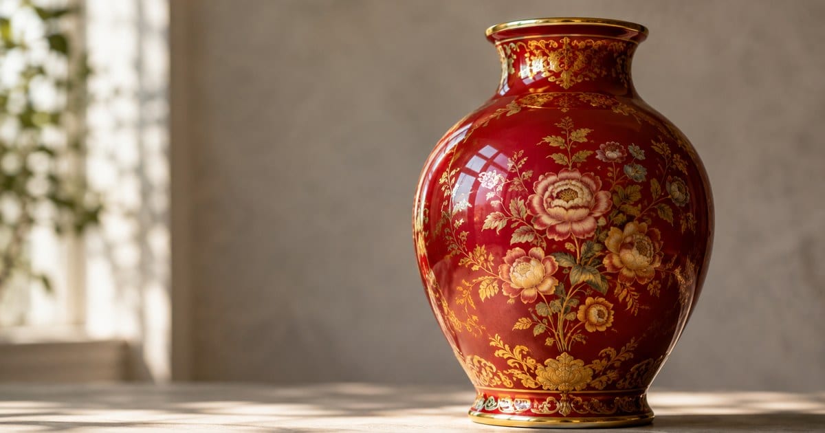
Around 1926 the mark changed to a plain script “Carlton Ware” name, usually with “Made in England” and sometimes a trade mark notice, dropping the W and R initials entirely. This is the single most important fact about Carlton Ware marks, because the company itself did not change hands or names for another three decades. The business traded on as Wiltshaw & Robinson using this script mark right through its most celebrated period, the Art Deco lustre wares of the late 1920s and 1930s, richly decorated with chinoiserie scenes, stylized florals, birds, and heavy gilding over deep, glossy colored grounds. Names in the ground-color family follow a pattern, with red, blue, green, and black versions of the same idea, and the deep red ground known as Rouge Royale is the one most people recognize. Ground-color lustre production continued well past the Deco years and into the mid-century, so the style brackets a piece loosely rather than tightly.
The company was formally renamed Carlton Ware Ltd in 1958. That rename is a real historical event worth knowing, but it is not a mark-dating test: the script mark carried on looking essentially the same before and after it, so a plain “Carlton Ware, Made in England” mark on its own only tells you the piece is later than about 1926, not which side of 1958 it falls on. The other output from across this span worth knowing is the molded embossed tableware: dishes, jugs, teapots, and serving pieces formed as overlapping leaves, fruit, or flowers, glazed in soft greens, yellows, and pinks. Salad and dessert ware in leaf forms, apple blossom patterns, foxglove, and similar naturalistic lines belong largely to the middle decades of the twentieth century and are very common in circulation.
Later marks, decline, and revival
The company changed hands in the 1960s and the marks eventually moved on again, toward a bolder printed wordmark and, later, a rubber-stamp mark distinct from the long-running script. Ground-color lustre lines continued into this period and remain saleable. Alongside them came bright novelty and advertising work, including the well-known Guinness advertising pieces with toucans and zoo characters, a mid-century category with its own dedicated collector base. In the 1970s the pottery produced Walking Ware, the tableware set on molded striped legs and shoes, which is now firmly collectible in its own right and is unmistakably of its decade.
The company ran into serious trouble at the end of the 1980s and went into receivership, with production ending around 1989 to 1992. The name and molds subsequently passed through other hands and pieces have been produced under revived ownership since the late 1990s. This matters when you are buying. A crisp, bright, uncrazed piece with a modern-looking printed backstamp and no wear may well be a late reissue rather than an early one, and it should be priced as such.
Reading the crown-and-globe mark closely
For pieces from the earliest window, the crown-and-globe device is worth learning to read carefully, since its variants are the main tool for narrowing a date inside that roughly 1894-to-1926 span.
Work through it in a fixed order. Start with the initials, since W and R confirm you are before about 1926. Then look at the crown: how many points it has, whether it is drawn in outline or filled, and how ornate the detailing is. Then the globe or roundel: whether it carries lines suggesting a sphere, whether text runs around it or through it, and how the name sits relative to it. Then the surrounding text: the town name, the country line, and any additional wording such as a trade mark notice or a hand-painted claim.
Two pieces of extra wording deserve attention regardless of which era’s mark you are looking at. Some marks carry a registration notice referring to Australian design registration, which reflects the pottery’s strong export trade to that market and appears on particular periods of production. Others carry wording indicating hand painting or hand decoration, which describes the finishing method rather than the date. Neither should be read as a maker’s name, and both are frequently misinterpreted as such in online listings.
Color of the printed mark is a minor but real signal. Marks appear in black, green, and other colors across the pottery’s life, and a mark color that is unusual for the decoration style on the piece is a reason to look harder rather than a verdict on its own.
Pattern numbers and what they add
Beside or below the backstamp on decorated pieces you will normally find a number painted by hand in enamel, sometimes with a letter prefix. This is the pattern number, and it identifies the decoration scheme rather than the shape.
Pattern numbers are the piece of evidence casual buyers ignore and specialists rely on. They were allocated in sequence as new decorations were introduced, so a number places the decoration within the pottery’s development even when the printed mark is a long-lived design that spans decades. Collector references and auction archives index pieces by these numbers, which means a legible pattern number turns a vague search into a specific one.
You may also find an impressed or molded shape number in the clay, separate from the painted pattern number. The two do different jobs: shape number for the form, pattern number for the decoration. Recording both gives you the strongest possible search terms, and photographing both is worth the extra thirty seconds.
Hand painting means these numbers vary in neatness and can be partly worn. A number that is faint but present is still worth reading in raking light, because it will narrow your search more than any amount of describing the flowers.
Watch-outs and common mistakes
- Treating a crown-and-globe mark and a script mark as separated by the 1958 rename. They are not. The crown-and-globe era ends around 1926, more than three decades before the rename, and conflating the two dates is how people misjudge which piece is actually earliest.
- Assuming the 1958 company rename shows up in the mark. It does not. The plain script mark looked essentially the same for decades on both sides of that date.
- Reading “Rouge Royale” as a date. It names a ground color and finish that were produced over a long stretch, not a specific year of manufacture.
- Mistaking the Australian registration wording for an origin. The pottery was in Stoke-on-Trent. That wording reflects design registration for an export market.
- Assuming lustre means Art Deco. Lustre and deep ground colors continued long after the Deco period, so the decoration style alone will not date a piece.
- Overlooking late reissues. Production under revived ownership after the original company failed means recent pieces carry the name legitimately. Condition that is too good for the claimed age is a prompt to check the mark carefully.
- Skipping the pattern number. It is the most searchable thing on the piece and the most commonly left out of listings and photographs.
- Judging by the front only. Two pieces with near-identical decoration can be forty years apart, and only the base will say so.
Photo tips
- Photograph the whole base square-on in soft daylight, close enough that the crown, globe, initials, and every line of surrounding text are readable rather than merely visible.
- Take a second base shot at a raking angle so any impressed shape number or molded lettering picks up a shadow.
- Shoot the painted pattern number as its own close-up. Enamel numbers are small and often partly worn, and a dedicated frame is worth more than a corner of a wider shot.
- Capture the full profile of the piece against a plain background so the form can be matched against documented shapes.
- Add one close shot of the decoration where gilding meets the ground color, in angled light, which shows gilt wear and the quality of the enamel work.
- Photograph the foot ring in profile so the glazed or unglazed finish and any wear are recorded.
Common questions
What do the letters W and R mean on a Carlton Ware mark?
They stand for Wiltshaw & Robinson, the Stoke-on-Trent firm that founded the business around 1890 and traded under the Carlton Ware name. Their presence in the crown-and-globe device places the piece before about 1926, when the mark switched to a plain script “Carlton Ware” name. That script mark then continued for decades, including through the company’s 1958 rename to Carlton Ware Ltd, so the initials tell you a piece is early, but their absence only tells you it is later than 1926, not which side of 1958 it falls on.
How do I date Carlton Ware if the mark is worn?
Work from the pattern number first, since a hand-painted enamel number identifies the decoration and can be searched against collector references and auction archives. Then read the decoration family, the shape, and the body. An impressed shape number, the finish of the foot ring, and the presence or absence of crazing all add supporting evidence when the printed backstamp is too rubbed to read.
Is Rouge Royale always valuable?
Not automatically. Rouge Royale describes a deep red ground with gilded decoration that the pottery produced over a long period and in large quantities, so condition, pattern, shape, and era matter far more than the name. Gilt wear, chips, and heavy crazing pull prices down sharply, and common shapes from later production sit well below scarce early decorated pieces in good order.
Related guides
- Royal Doulton Marks Identification
- Delft Pottery Marks: Real vs Tourist Delftware
- Antique Porcelain Marks: How to Read Backstamps
- Antique Pottery Marks
When to use the Antique Identifier app
Carlton Ware is a good fit for a photo-based first pass because the decorative lines are visually distinctive and the pottery produced a lot of them. Shoot the base square-on, the base at a raking angle, and the full profile, and the app can suggest which decoration family and which mark era your piece resembles. That is exactly the narrowing step that is slow if you are looking at a lustre vase and do not yet know whether you are looking at the crown-mark era or the long script-mark era that followed it. Use the result to focus your search, then confirm it by reading the initials in the mark and matching the pattern number against auction archives before you settle on a description or a price.