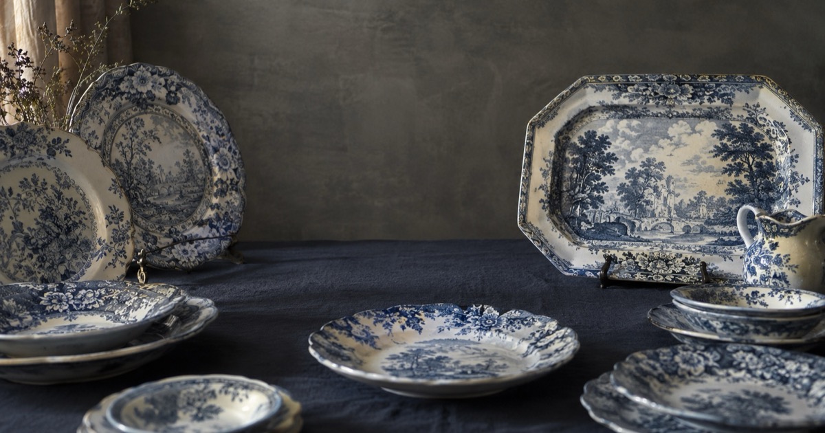
Transferware identification starts with a loupe and ends at the backstamp: once you can recognize the look of an engraved print up close and decode the cartouche on the reverse, most pieces give up their story quickly. Transfer printing let English potteries copy an engraved copper-plate design onto tissue paper with ceramic pigment, press it onto the ware, and fire it under the glaze — which is how Staffordshire put scenic dinnerware on ordinary tables by the millions from the late 1700s onward.
Transferware is pottery decorated with an engraved print rather than a brush: under a 10x loupe the design resolves into fine engraved lines and stippled dots, and a printed cartouche on the back usually names the pattern. Start by magnifying a shaded area — hand-cut dots and cross-hatching confirm a transfer print, and the backstamp then narrows maker and date.
By the end of this guide you will be able to confirm that a piece is transfer-printed rather than hand-painted or decal-decorated, use its color and marks to bracket a date, and make an honest call about whether you have a common pattern or something worth deeper research.
Quick identification checklist
- Put a 10x loupe on the design and look for fine engraved lines and stippled dots instead of brush strokes.
- Hunt for pattern seams near rims, spouts, and handles — faint gaps or misalignments where sections of transfer tissue met.
- Flip the piece: a printed cartouche usually names the pattern, with the maker hiding in small initials.
- Look for a diamond-shaped English registry mark, which places a design firmly in the mid-1800s.
- Use color as a rough clock: blue came first and never left; red, brown, green, and purple broadly signal the 1820s onward.
- Compare two pieces from the same set — identical designs mean a print, not a painter.
Transferware identification under a loupe
A transfer print is an engraving reproduced on pottery, and under magnification it looks like one. Expect fine parallel lines, cross-hatching in the shadows, and stippling — small dots the engraver punched to shade skies, water, and faces. The dots vary slightly in size and spacing because a hand cut them, and the pigment sits flat under the glaze rather than standing up in relief.
The tissue that carried the design had to be cut into sections to fit a curved object, and the joins survive as evidence. Check the rim border, the area around handles, and the shoulders of hollowware for hairline gaps, doubled pattern, or a border motif that suddenly jumps out of step. These seams and small slips are normal on period transferware. Faint smudges, ghosting, and softened lines are also consistent with the process, since prints were applied by hand-rubbing and the glaze firing could blur them slightly.
The color timeline, in broad strokes
Cobalt blue dominated early transferware because it was the pigment that reliably survived the high-temperature glaze firing. The earliest prints, and the great majority made before the 1820s, are blue — and blue stayed in production ever after, which is why blue alone proves nothing.
As pigment chemistry improved, potteries added red, pink, brown, green, purple, and black, generally from the 1820s and 1830s onward. Two-color prints, prints filled in by hand with enamel washes, and the deliberately blurred look sold as flow blue belong broadly to the middle of the 19th century and later. Treat color as a bracket, not a date: a brown romantic scene is unlikely to be Georgian, but a blue one could be 1810 or 1990.
Backstamps, cartouches, and the registry diamond
Flip every piece. Victorian transferware typically carries a printed backstamp in the same color as the front: a scrolled ribbon, garter, or floral cartouche framing a pattern name such as Asiatic Pheasants, with the maker reduced to initials tucked underneath. Match the initials and the pattern name together and you can usually run the firm down in standard mark references.
A diamond-shaped registry mark means the design was registered under the British system used from the 1840s into the early 1880s. It dates the registration, not the object — popular designs stayed in production for years — but it hands you a firm “no earlier than” anchor. The word “England” in a mark generally signals the 1890s onward, and “Made in England” usually points to the 20th century. Impressed marks pressed into the clay are worth a pass of raking light, since they often record the maker even when the printed mark has worn or blurred.
Romantic and historical Staffordshire scenes
Two families of imagery account for much of what you will find. Historical Staffordshire — often in a deep, inky blue — showed real places and events, including American cities, buildings, and patriotic subjects made specifically for the US market in the early 19th century. These are heavily collected, and the earlier and darker the blue, the harder collectors look.
Romantic transferware came later and in far greater volume: invented landscapes of castles, rivers, ruins, gondolas, and vaguely exotic temples, named for places the engraver may never have seen. Makers reused border designs across many center scenes, so when a center view stumps you, the border is often the faster route to a maker. Remember that the name in the cartouche describes the fantasy, not the factory.
Transfer print vs hand-painted vs modern decal
Hand-painted ware shows brush character: strokes with direction, pigment that pools where a line ends, enamel you can sometimes feel, and small differences from piece to piece. A transfer shows engraved line and stipple and repeats identically across a set.
Modern decals are the third look, and the loupe settles it. A decal breaks the image into uniform dots in tidy rows or rosettes, like a magazine photo, and often sits on top of the glaze as a thin film with a faint edge. If the dots are mechanical and even, the piece is 20th century or later no matter how Victorian the scene looks.
What transferware is actually worth
Honesty helps here. Romantic-era transferware was made in enormous quantities over a very long run, and common blue patterns in standard plate sizes are plentiful, attractive, and usually inexpensive. Value concentrates in early dark-blue American historical views, scarcer colors such as mulberry, purple, and black, large or unusual forms like platters, tureens, and pitchers, and crisp early printing.
Condition rules everything: knife scratches, stains, hairlines, chips, and heavy discolored crazing cut value far more than age adds it. Reproductions and modern reissues of romantic scenes exist, many decal-printed on bright white bodies; the dot test and an implausibly clean back are your defense.
Watch-outs and common mistakes
- Reading the cartouche’s pattern name as a maker — the name is the design, and the firm is usually just initials.
- Assuming blue means early; blue transferware has been produced continuously into the modern era.
- Treating a registry diamond as a production date — it marks design registration, and production often ran for years afterward.
- Trusting crazing as proof of age; new ware crazes too, and stained crazing is a defect, not a credential.
- Missing decal reproductions — uniform halftone dots under a loupe end the debate.
Photo tips that improve identification
- Take one straight-on macro of a shaded area such as a sky, where stipple dots are easiest to resolve.
- Photograph the entire backstamp flat-on and in focus, then a second shot in raking light for impressed marks.
- Capture the rim border where transfer seams and misalignments tend to live.
- Shoot the full front in even daylight so the whole scene and border are searchable.
Common questions
Is unmarked transferware worth anything?
Yes, an unmarked piece can still have value, since many early pieces carried no printed backstamp at all. Identification then runs through the pattern itself: the center scene and especially the border can be matched to documented patterns and makers. Value follows the usual rules — early dark-blue printing, scarce colors, large forms, and clean condition matter far more than the presence of a mark.
How can you tell transferware from a modern reproduction?
Put a loupe on a shaded area of the design. Period transferware shows hand-engraved lines and irregular stipple dots under the glaze, while most modern reproductions are decal-printed and break into uniform halftone dots in tidy rows, often sitting on top of the glaze as a thin film. A bright white body and an implausibly clean, unworn back are supporting warnings.
What does the name on the back of transferware mean?
The name in the printed cartouche is almost always the pattern name, not the maker. Names like Asiatic Pheasants or a romantic place name describe the design, and the factory is usually reduced to small initials tucked under or near the cartouche. Match the initials and the pattern name together in a mark reference to pin down the firm.
Related guides
When to use the Antique Identifier app
Photograph the whole piece front and back, then add tight detail shots of the cartouche and a magnified patch of the print. The app narrows the pattern family, likely era, and probable maker fast, which turns an hour of mark-book paging into minutes. If it points to something rare — early historical Staffordshire, an uncommon color, a sought-after maker — treat that as a prompt for deeper verification, not a final answer.